Scatter Plot Maker
Generate interactive scatter plots to explore relationships between variables. Upload spreadsheets, highlight clusters, and share insights instantly.
Scatter Plot Maker
Why teams use this scatter plot maker
Bring clarity to bivariate datasets without writing code or installing desktop apps.
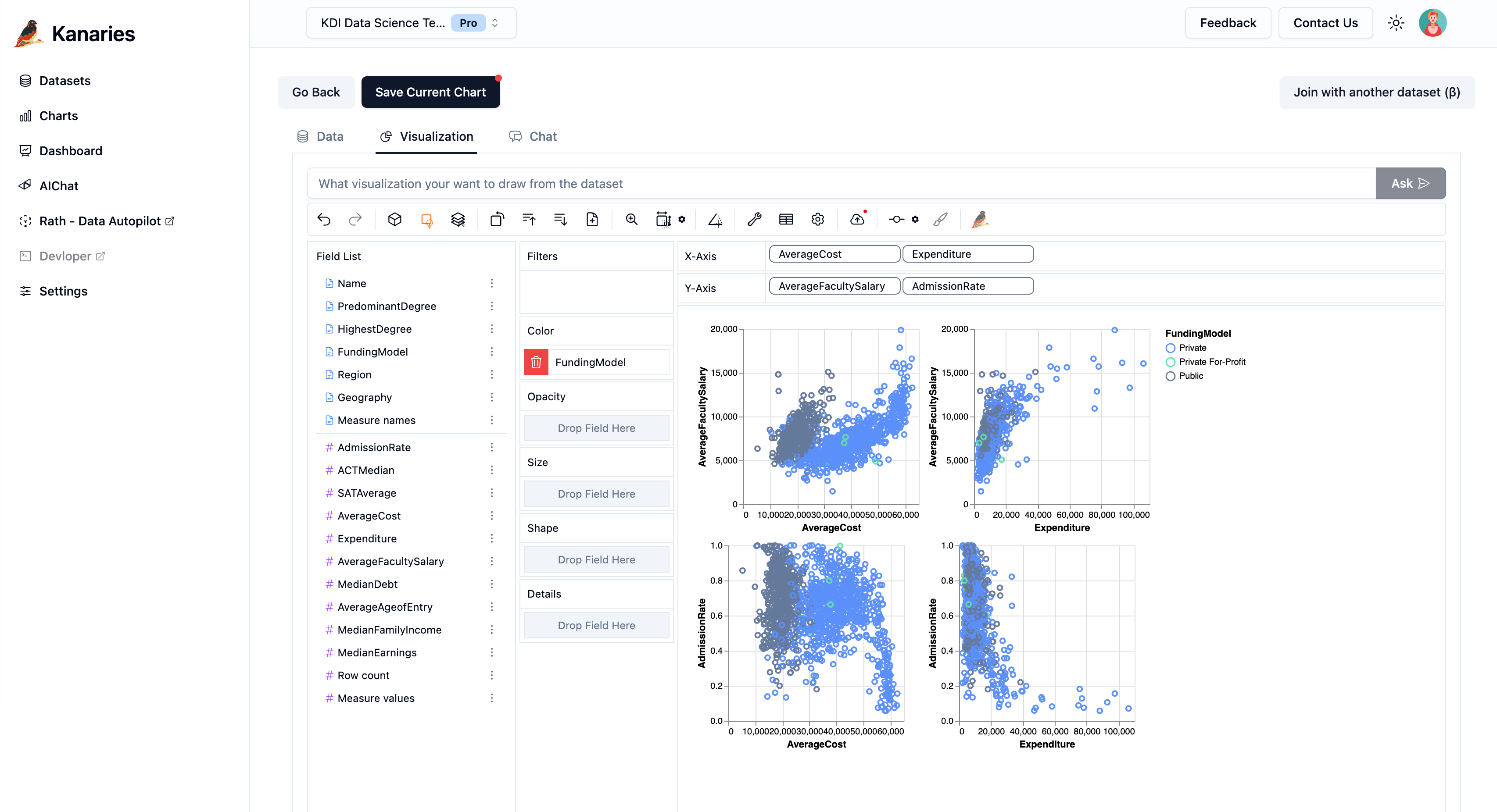
Upload spreadsheets or paste data
Bring in CSV, Excel, or JSON files—or paste tables from pandas/R—and start plotting instantly.
Encode categories with color and size
Drag fields to color, size, and tooltip channels to add context without writing code.
Shareable exports and embeds
Download PNG/SVG images or copy an iframe embed for docs, Notion, or internal portals.
How to make a scatter plot online
Everything runs in the browser. No drivers, notebooks, or installs required.
- 01
1. Add your dataset
Upload a CSV/Excel/JSON file or paste data directly into the grid.
- 02
2. Configure axes and encodings
Choose X/Y fields, set colors or point sizes, and adjust axis scales.
- 03
3. Explore and share
Filter, zoom, and brush to find patterns, then export or embed the visualization.
What you can do with scatter plots
Product analytics
Compare usage, retention, and revenue metrics to spot outliers.
Science & research
Plot experiment results or survey answers to test hypotheses.
Business reporting
Highlight KPI relationships in decks and dashboards.
Scatter plot maker FAQs
- Does the scatter plot maker keep my data private?
- Yes. Data stays in your browser session; nothing is uploaded once you close the tab.
- What file types can I use?
- Use CSV, Excel (.xls/.xlsx), or JSON data. You can also paste tables from spreadsheets or notebooks.
- Can I customize colors and tooltips?
- Absolutely. Pick color palettes, size ranges, and tooltip fields so every point tells the right story.
More chart makers
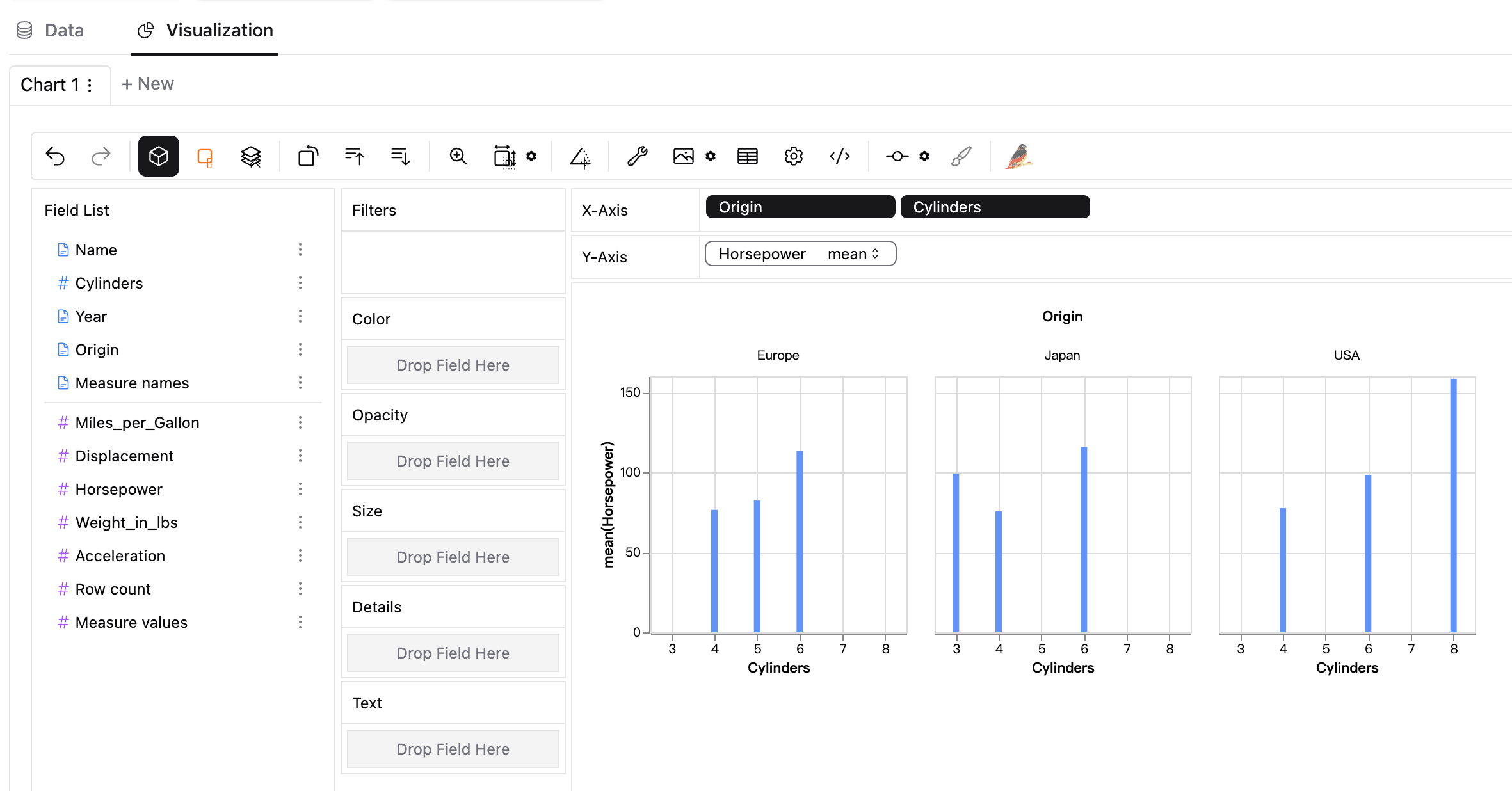
Chart / Graph Maker
Graph Maker
Histogram Maker
Box Plot Maker
Dot Plot Maker
Stem and Leaf Plot Maker
Line Graph Maker
Bar Graph Maker
CSV to Chart
Parquet to Chart
CSV to Visualization
JSON to Chart
JSON to Visualization
Excel to Chart
SQLite to Chart
Excel to Visualization
SEO Visualization
Bubble Map Maker
Pivot Chart
Need full dashboards? Try our Chart Maker.