Free Online Graph Maker
Create bar graphs, line graphs, pie charts, and more from your spreadsheet data. Drag and drop to build graphs instantly — no signup, no install, 100% browser-based.
- Upload CSV, Excel, or JSON data to start graphing instantly.
- Drag-and-drop interface — no coding or design skills needed.
- Support 50+ graph types: bar, line, pie, scatter, area, and more.
- Export graphs as PNG or SVG for reports and presentations.
- 100% browser-based — your data never leaves your device.
Graph Maker Tool
Why Use This Free Graph Maker
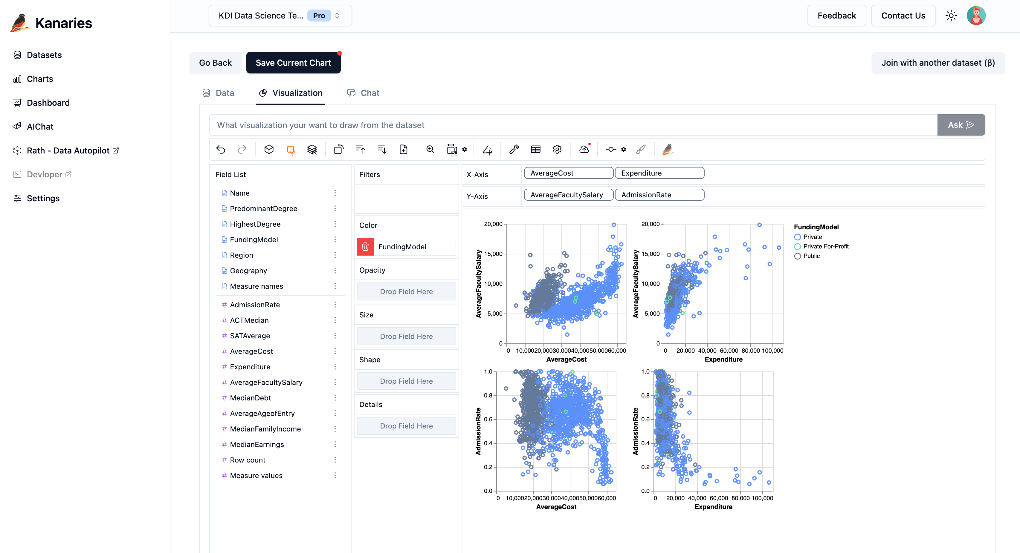
Drag-and-Drop Graph Builder
Build graphs visually by dragging data fields onto axes. No formulas, no coding — just select your columns and choose a graph type to see results instantly.
50+ Graph Types Supported
Create bar graphs, line graphs, pie charts, scatter plots, area charts, histograms, heatmaps, and more. Switch between graph types with one click to find the best visualization for your data.
Import Any Spreadsheet Data
Upload CSV, Excel (.xlsx), or JSON files directly. You can also paste data from clipboard. The graph maker auto-detects columns and data types so you can start graphing immediately.
Export as PNG or SVG
Download your finished graph as a high-resolution PNG image or scalable SVG vector file. Perfect for reports, presentations, academic papers, and social media posts.
No Signup, No Installation
Start making graphs immediately without creating an account or installing software. Open the page, upload your data, and build your graph — it's that simple.
100% Private & Browser-Based
All data processing happens locally in your browser. Your spreadsheet files are never uploaded to any server, keeping your sensitive data completely private and secure.
What Is a Graph Maker?
A graph maker is a tool that converts raw data into visual charts and graphs. Graphs help you spot trends, compare values, and communicate insights more effectively than tables of numbers. Whether you need a simple bar graph for a class project or a complex scatter plot for data analysis, a graph maker turns your spreadsheet data into clear, professional visuals.
This free online graph maker supports all these graph types and more. Simply upload your data, choose a graph type, and customize colors, labels, and axes to create presentation-ready visualizations in minutes.
Bar Graphs & Column Charts
Compare categories side by side. Bar graphs are ideal for showing differences between groups, ranking items, or displaying survey results. Horizontal and vertical layouts are both supported.
Line Graphs & Trend Charts
Visualize changes over time. Line graphs are perfect for tracking trends, growth patterns, stock prices, temperatures, or any time-series data with a continuous x-axis.
Pie Charts & Donut Charts
Show proportions and percentages. Pie charts break down a whole into its component parts, making it easy to see how each category contributes to the total.
Scatter Plots & Correlation Charts
Explore relationships between two variables. Scatter plots reveal correlations, clusters, and outliers in your data, making them essential for statistical analysis and research.
How to Make a Graph Online
- 1
Upload Your Data
Drag and drop a CSV, Excel, or JSON file into the graph maker above. You can also paste data directly from a spreadsheet. Your columns will be automatically detected and ready to use.
- 2
Choose Your Graph Type
Select from bar graph, line graph, pie chart, scatter plot, area chart, and many more. Use the mark type selector to switch between graph types instantly and preview how each one represents your data.
- 3
Drag Fields to Build Your Graph
Drag column names onto the X-axis, Y-axis, color, and size shelves. The graph updates in real time as you assign fields. Experiment with different combinations to find the most insightful visualization.
- 4
Export or Share Your Graph
Download your finished graph as a PNG image or SVG vector file. You can also embed the interactive graph on your website or share it with your team.
Graph Making Best Practices
Choose the Right Graph Type
Use bar graphs for comparing categories, line graphs for trends over time, pie charts for proportions, and scatter plots for correlations. The right graph type makes your data story clear.
Keep It Simple
Avoid cluttering your graph with too many data series, colors, or labels. A clean, focused graph communicates its message faster and more effectively than a busy one.
Label Axes Clearly
Always label your X and Y axes with descriptive names and include units where applicable. Clear axis labels help your audience understand the graph without additional explanation.
Use Consistent Colors
Stick to a consistent color palette throughout your graphs. Use distinct colors for different categories and avoid using red and green together for accessibility.
Start Y-Axis at Zero
For bar graphs and area charts, start the Y-axis at zero to avoid misrepresenting the scale of differences. Truncated axes can exaggerate small variations.
Add Context with Titles
Give your graph a clear, descriptive title that summarizes the key insight. A good title tells the viewer what to look for in the graph.
Graph Maker FAQ
How do I make a graph online for free?
Upload your CSV, Excel, or JSON data file to the graph maker on this page. Select a graph type (bar, line, pie, scatter, etc.), drag your data fields onto the axes, and your graph will be created instantly. Download it as PNG or SVG when you're done. No signup or payment required.
What types of graphs can I create?
You can create bar graphs, line graphs, pie charts, scatter plots, area charts, histograms, heatmaps, box plots, and many more. The graph maker supports over 50 chart and graph types to cover any data visualization need.
Is my data safe when using this graph maker?
Yes. This graph maker runs entirely in your browser. Your data files are never uploaded to any server — all processing happens locally on your device. Your data stays completely private.
What file formats are supported?
You can upload CSV (.csv), Excel (.xlsx, .xls), and JSON files. You can also paste data directly from Google Sheets, Excel, or any other spreadsheet application.
Can I customize the colors and labels of my graph?
Yes. You can customize colors, axis labels, legends, and other visual properties of your graph. Drag fields to the color shelf to apply color encoding, and use the settings panel to adjust specific styling options.
How do I export my graph as an image?
Click the export button in the graph toolbar to download your graph as a PNG or SVG file. PNG is best for presentations and social media, while SVG provides scalable vector graphics for print and web embedding.
What is the difference between a graph and a chart?
The terms are often used interchangeably. Technically, a graph usually refers to visualizations that show relationships between data points (like line graphs and scatter plots), while a chart is a broader term that includes tables, diagrams, and other visual formats. This tool creates both graphs and charts.
Can I make a graph from Google Sheets data?
Yes. Copy your data from Google Sheets and paste it directly into the graph maker. Alternatively, download your Google Sheets data as a CSV file and upload it. Both methods work seamlessly.
More chart makers
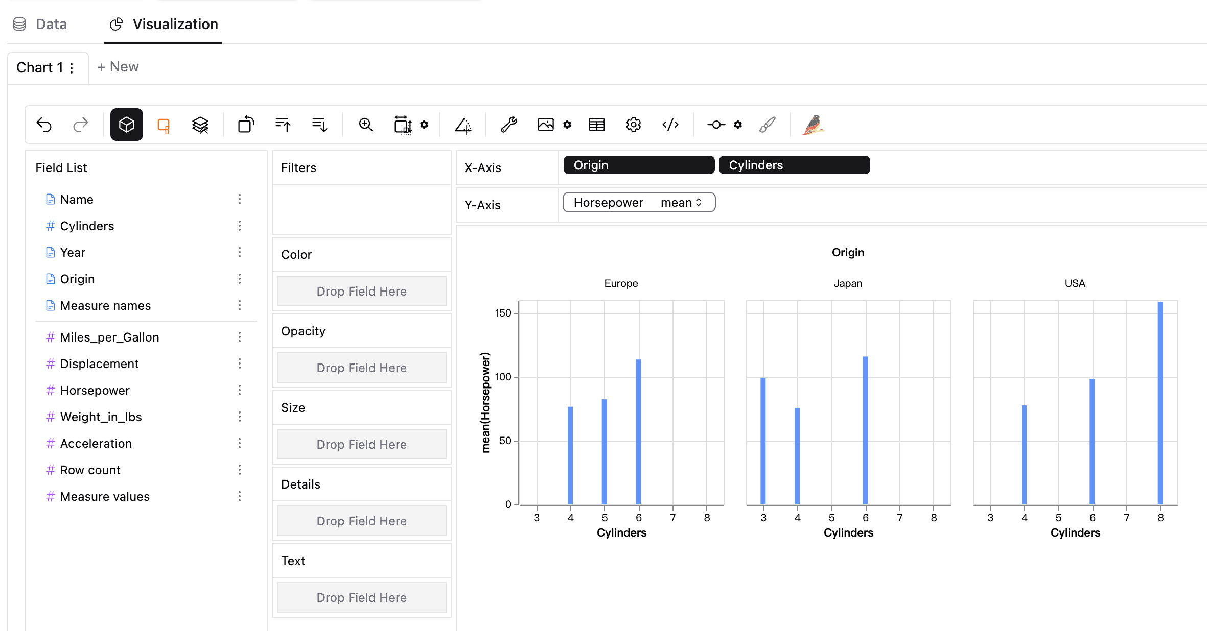
Chart / Graph Maker
Scatter Plot Maker
Histogram Maker
Box Plot Maker
Dot Plot Maker
Stem and Leaf Plot Maker
Line Graph Maker
Bar Graph Maker
CSV to Chart
Parquet to Chart
CSV to Visualization
JSON to Chart
JSON to Visualization
Excel to Chart
SQLite to Chart
Excel to Visualization
SEO Visualization
Bubble Map Maker
Pivot Chart
Need more chart options? Try our Need more chart options? Try our for advanced visualization.